Quick one today with a beach emphasis.
One of my projects this summer is to learn the Balltime app. It has indoor applications as well, but the beach applications are really exciting to me. I’ve spoken on this before, but the logistical challenges of applying advanced statistics to the beach are myriad. A typical set of beach volleyball is about 37 points, which means that, in order to stat all 5 pairs1 in NCAA beach, you’re looking at about 370 rallies- and that’s without any of them going to 3.
A 4-set indoor match is in the ballpark of 180 rallies, which means that an NCAA beach duel is twice as much volleyball for coaches to analyze and process. Good thing all you NCAA Beach coaches get paid more than your indoor counterparts. Right? Right???
Balltime isn’t perfect yet, but I was surprised how good it was at identifying actions and players. I’ll have more to say about how to maximize this app over the summer. I’m starting my analysis of the NCAA Nationals, but it will take me some time to finish that up, so in the meantime I’ll have some other beach content.
One tool I’ve enjoyed using is the trajectory tool. For example, I took the LMU v USC 1s pair match and analyzed passing trajectories for the 4 players in the match.
(One quick note: I only used passing on the near side, because the trajectories from the far side are pointing the other way, so it gets confusing. Balltime: maybe consider the possibility to change colors on the trajectory tracer?)
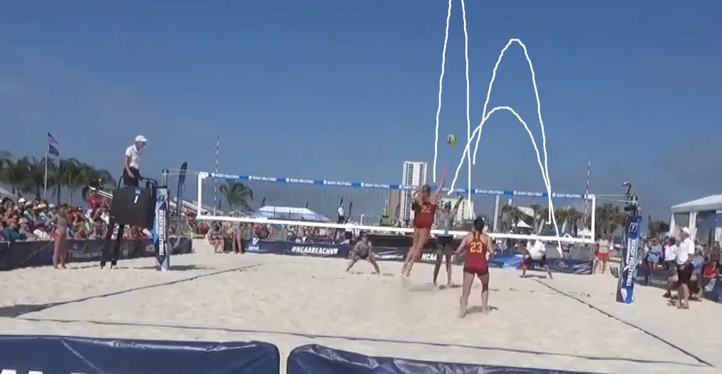
USC - Maple
We’d all love our passing trajectories to look like this. 3 pretty clean arcs, all ending up in a similar place. If we could give an objective precision score that measured how closely a passer’s balls were clustered, Maple would have the best score in the match.
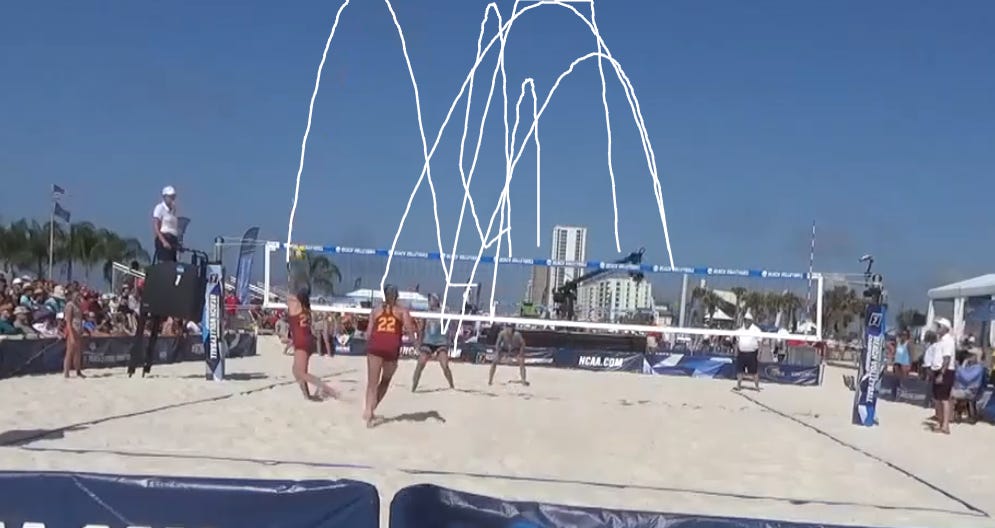
USC - Kraft
When I look at these trajectory arcs, I see most of them clustered in the center but about 3 arcs that get pushed too far to the right and one (the play shown in the image) where the ball is semi-shanked off to the left.
Kraft was also getting served a lot more, especially on this side, so she also just has a lot more data.
LMU - Shaffer
One thing that strikes you is the variation in the starting positions for the passes that Shaffer made in this match. You can see she’s even crossing the center of the court for one of those passes. More on that below…
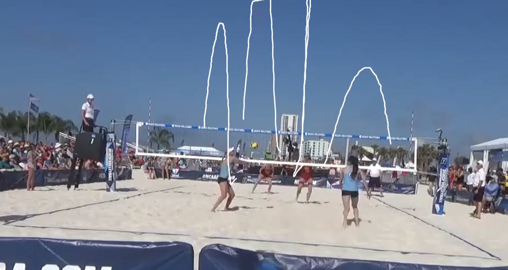
LMU - Prihti
Prihti received the most serves (especially on this side), which explains why Shaffer was pinching over to protect her. We can see that in this image.
But we can also see that there’s a ton of variety in where she’s receiving serve as well. Combine this chart with Shaffer's, and this shows me that USC did an excellent job of moving the LMU passers around.
And interesting piece of study, if I can get my hands on the coordinate data (which I think Balltime can/will provide me), is to compare Sideout % to the distance of the pass.
Just off the eye test from the above image, can’t you almost see the arc of the ideal pass? It’s usually not all the way back to your partner. There’s some ideal difference, which is why most beach players use more of a relational target, based on where they receive the serve, rather than a fixed passing target, as in indoor volleyball.
What else did you notice? Leave me a comment!
And really, you want to stat your 6s as well.


