
25 NCAAM Triangles Part 1
Terminal Serving
I’ve been doing a bunch of Triangle analysis here in the spring.
24 NCAA Women’s Analysis
25 LOVB Analysis
What’s still left on the calendar? The NCAA Men’s season, plus the PVF. Of course, there’s also European Champions League and other international competitions. I might be able to get some analysis done on those championships, but… there’s only so much time and space without SmarterVolley turning into nothing but match analysis posts. So we’ll see.
But for now, men’s volleyball! As a reminder, if you are unfamiliar with the Triangle analysis framework or some of the other terminology I use here, check our the Triangle Primer that I updated for this year. The data that I used was from the top-20 teams, plus playoff qualifiers Belmont Abbey, Penn State, and Daemen. I didn’t include Fort Valley St because they don’t have enough matches up on Volleymetrics.
2025 NCAA Men - Terminal Serving
Let’s take a look at how the Terminal Serving part of the game influenced winning in this year’s NCAA Men’s Volleyball season.
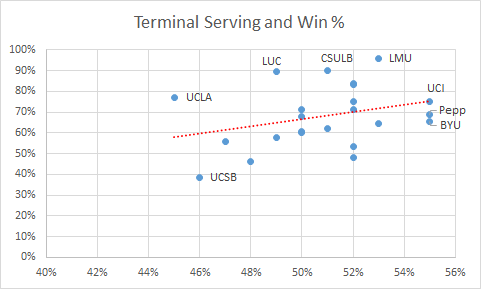
Yes, the dot that’s up at the top of the Win % is not Long Beach, it’s Lincoln Memorial, who dominated their independent schedule to the tune of 24-1 this year. So expect to see them at the top of many of the rankings. We see Irvine, Pepperdine, and BYU over on the right side of the graph as the best Terminal Serving teams this year.
All 3 were among the top in Serve-In % with 83.6%, 83.3%, and 83.8% respectively. Mount Olive, Ball State, USC, and Lewis were higher in this top-20+ group. Irvine was high-ace as well, which put them at the top of Ace:Error ratio by a decent margin. They were the only team in the sample with better than a 0.50 Ace:Error ratio, meaning they were the only team who served an ace for every two missed serves. Pepperdine wasn’t far behind with a 0.47 A:E ratio- slightly lower Ace% to go with a slightly lower Opponent Ace% as well.
The mediocre position of both Long Beach and Loyola Chicago on this graph also highlights a downside of using “% of Terminal Serves” on a season-wide sample for men’s volleyball: dominant teams in a high sideout environment show poorly on this measure because everybody serves significantly more aces than errors and when you win a lot of points, you are serving more often than your opponents.
Because of this, you see there’s not a super-strong correlation (the dashed red line) between Terminal Serving and Win %. In this group it, was only 0.32. That’s not nothing, but it’s not huge.
By most metrics, Long Beach was one of the best Terminal Serving team in the country- and yet they only won 51% of Terminal Serving points! They missed a lot of serves, but were #1 in both Ace % and Opponent Ace %. Similar for Loyola: 5th in Ace %, 4th in Ace Prevention. But they were in high-sideout environments and had huge Sideout Differentials (15.3% for Long Beach and 11.6% for Loyola) that it skews their numbers.
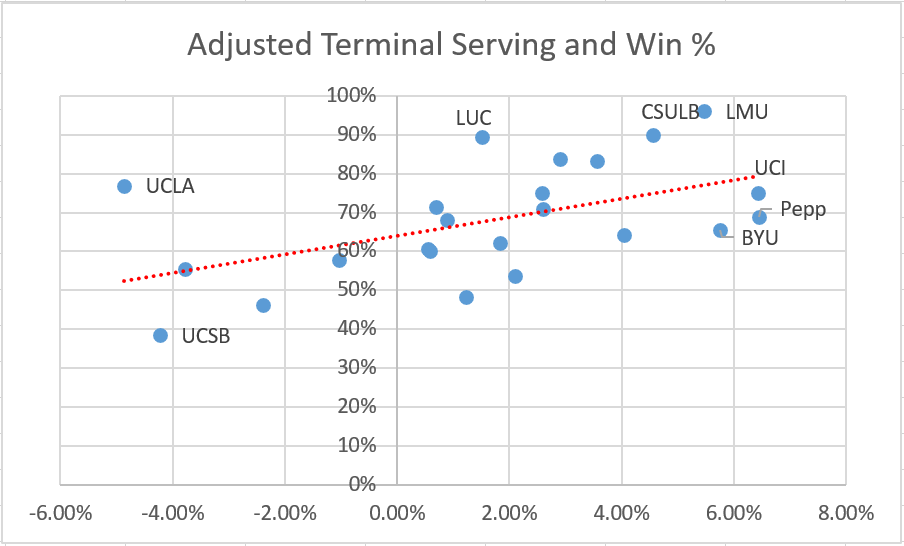
Let’s make a little adjustment:
adjTS = (Ace % + Opponent Error %) - (Opponent Ace % + Our Error %)
Now the correlation bumps up to 0.53 and the graph makes more sense:
Adjusting For Risk
Finally, what about the fact that Sideout % is skewed upwards in men’s volleyball? When analyzing girl’s volleyball, such as typical high school or club volleyball, we don’t have to adjust much for risk, because Sideout % is pretty close to 50%. Missing a serve hurts you about as much as getting an ace helps you.
But in men’s volleyball (and high level women’s volleyball), this ceases to be the case. Serving an ace (and also: saving one) helps you significantly more than a service error hurts you. How much risk should a team take?
Let’s imagine service risk as a perfect dial. You turn it up and you serve more aces while missing more. You turn it down and you serve fewer aces while missing less. In this case, the idealized ace:error ratio would match the “sideout on aces and errors” to “sideout without aces and errors”.
Sideout On Aces And Errors = (1/A:E Ratio) / (1 + 1/A:E Ratio) or (E:A Ratio) / (1 + E:A Ratio)
Ex: 0.5 A:E Ratio means 1 Ace for every 2 Errors. 1/0.5 = 2. Then your formula becomes 2 / (1 + 2) = 2/3 = 0.67. In words: If you serve 1 ace and 2 errors, the other team has sided out twice (on the 2 errors) on 3 serves (2 errors + 1 ace) which means they sided out 2 out of 3 times which means they sided out 67% of the time.
Sideout Without Aces And Errors is slightly more complicated to calculate1 but even easier to imagine conceptually. The other team serves in and it’s neither an ace nor an error. Did you sideout or not. The median “Sideout Without Aces And Errors” or “Sideout On Balls In Play” was 65%. Then, in theory, the median Ace:Error ratio should be about 0.5, for these two to balance out. Only UC Irvine was above that mark, with Pepperdine (0.47) next up. Long Beach (0.43), Lewis (0.43), Hawaii (0.42), and Ohio State (0.40) were next in line.
Now of course, there’s also the fact that serving tougher makes it more difficult to sideout. The question is: how much more? And which teams seem to balance serving tough with their block/defense? More on this on Wednesday.
It’s only complicated because you don’t normally have a “Sideout on Balls In Play” (we’ll call that SO_BIP) stat so you have to derive it from overall Sideout %.
SO = (SE * SO_E) + (SA * SO_A) + (S_BIP * SO_BIP)
SO_E = 1.0
SO_A = 0.0
S_BIP = 1 - Error % - Ace %
Then SO_BIP% = (SO% - SE%) / (1 - SE% - SA%)